RBC Rewards
Responsibilities
UI/UX Design, Competitive Analysis
Internship
RBC
Overview
Updating RBC Rewards, a points-based digital storefront, for a more seamless and enjoyable experience.

Project Background
During my Internship with RBC, I was tasked with conceptualizing additional features for RBC Rewards.
Objective
Improve the user-experience of the RBC Rewards desktop and mobile website to bring it up to the standards of a modern digital store-front.
Research Strategy
Analysis
I started the process with conducting an audit of the current website and seeing if I could spot areas to improve. I compared the current website to other online mass, and bespoke retailers.
User journeys for each website were created based on user-tests which included browsing merchandise, adding items to the shopping cart, and checkout.

Amazon, Walmart, LAFAURIE, Timbuk2, KITH and RBC Rewards
Findings
Upon distilling user-feedback, I discovered three areas on the RBC Rewards website that could be improved upon.
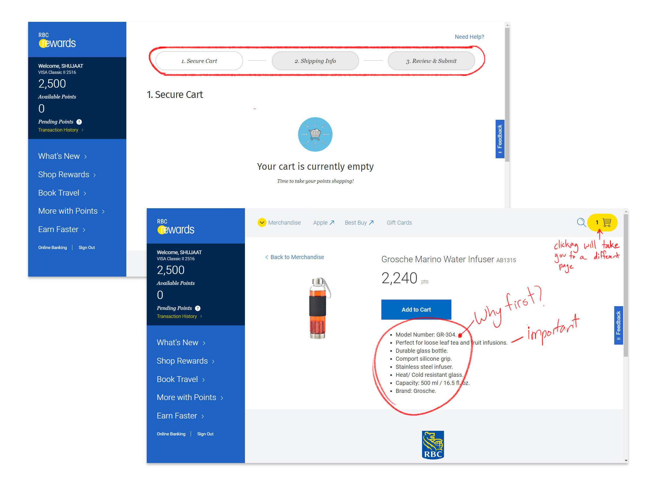
- Clicking the shopping cart icon would cause users to
lose their place on the page, due to it’s infinite scroll set-up.
-
Product Information wasn’t shown in a way which would be useful for the viewer.
- The progress bar during checkout didn’t fit the design language of the website.
Solution Development
The Constraint
Before working towards solving the outlined problems, I want to understand to get a better insight on how the Rewards platform worked. I consulted with the design, engineering and QA team to learn about the
bottlenecks in the Rewards platform.
-
The current store has hundreds of products, and solutions should scale to all of them.
- The backend system has a limited number of images per product, and the images supplied by vendors can be of varying quality.
- It’s a legacy system.
The best step forward was to keep the solutions incremental.
The Shopping Cart
A Shopping Cart Preview was created to allow users to see the contents of their cart without jumping to a different page.
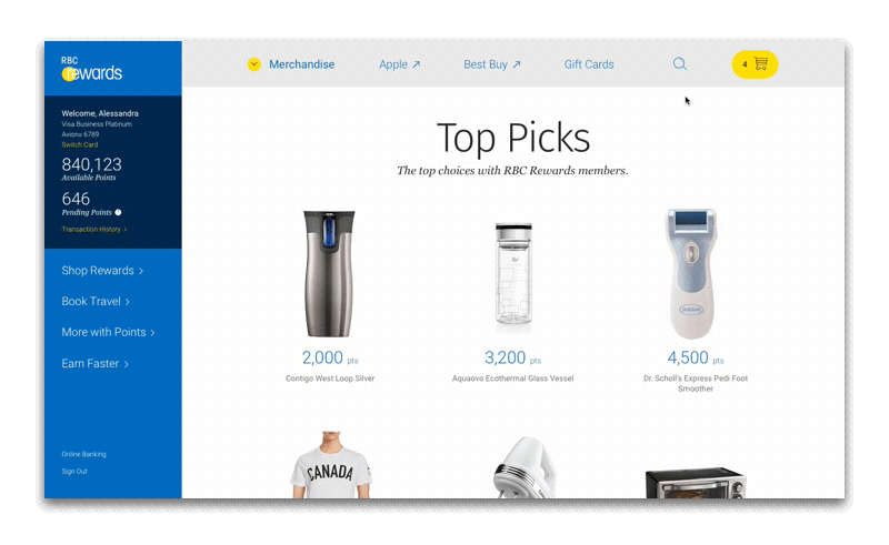 The ability for the user to glance into their cart
brought tangible benefits to the shopping experience. Users could now see their subtotal, and remove unwanted items while not interrupting their browsing experience.
The ability for the user to glance into their cart
brought tangible benefits to the shopping experience. Users could now see their subtotal, and remove unwanted items while not interrupting their browsing experience.Mobile
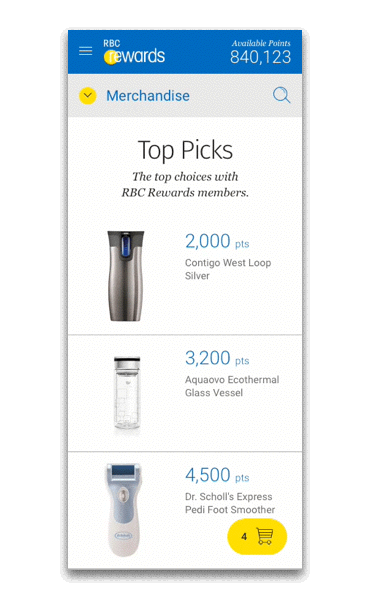
A mobile version of the cart was also created.
A working prototype was created in Origami Studio︎ to communicate the functionality of the cart preview to the team.
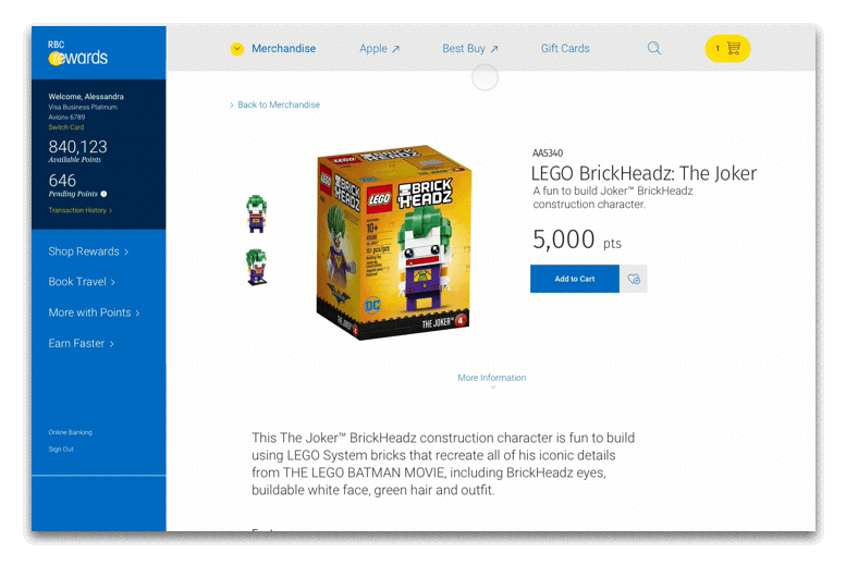
The Products
Users should always be given the right information when they are thinking of purchasing a product.
All the relevant information about the product was shifted to the top half of the page, as not to overwhelm the user. The less vital information is still on the page, but just displayed after the page break.
Playing Favorites
The points system of RBC Rewards makes it a different shopping experience than most websites. You don’t pay with money, but with points accumulated over a period of time.
The inclusion of a “favorite” button would allow the website to notify the user of when they would have enough points for a given product.

The ︎ is a reminder for users to take advantage of their earned currency.
The Progress Wizard
The visual consistency is a key component of any brand’s visual language. The new Progress Wizard was streamlined to be cleaner, and less cluttered to match the visual style of RBC design systems.
![]()
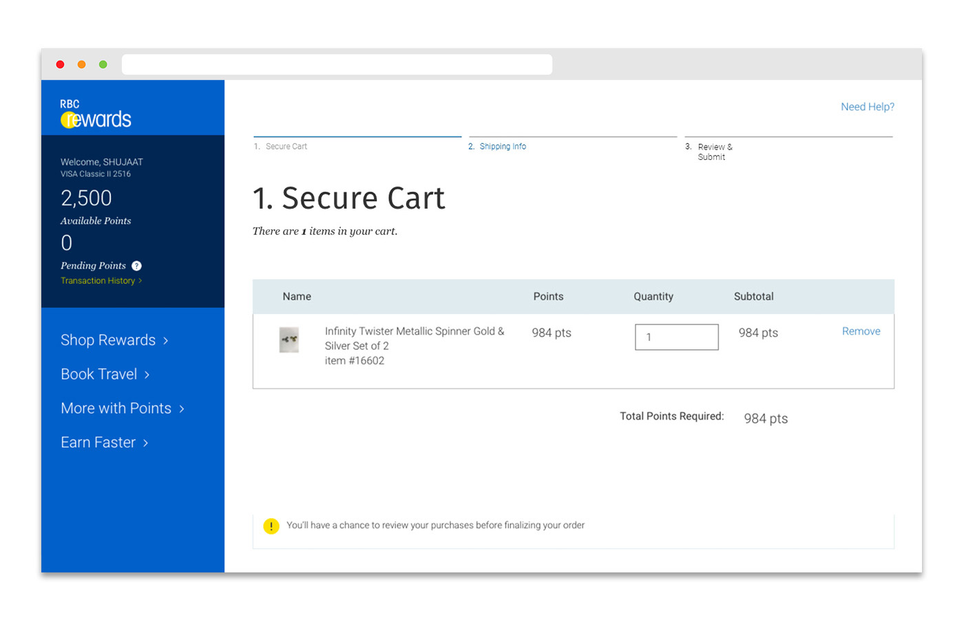
The new Progress Wizard was created with the intention of it being carried out to other RBC services, not just be used exclusively for the Rewards platform.
![]()

The use of motion emphasizes the journey users would be taking.
Takeaways
Working on the RBC Rewards update was an effort in finding simple and uncomplicated solutions.
External factors such as team bandwidth and backend infrastructure can limit the amount of change you can bring to an already existing platform. As such, it is critical to understand those limitations during the design process and work within them.